Is your space missing the energy and balance that make interiors truly unforgettable? Opposition in Interior Design is a powerful tool. It brings contrast, rhythm, and excitement to your home or project.
At Landmarks Architects, we help homeowners, designers, and developers find balance through creative tension. With years of experience, we can help you use opposition well and wisely.
In this article, you’ll learn how to:
- What opposition in interior design really means
- Different types of opposition—from color to texture to scale
- How opposition influences mood and emotional response
- Practical ways to apply this concept in every room
- Mistakes to avoid and tips for achieving the right balance
Ready to unlock the hidden power of contrast in your interiors? Keep reading to learn how to use contrast to make your rooms feel cohesive, lively, and uniquely yours.

Understanding Opposition in Interior Design
Opposition in interior design refers to the use of two or more elements placed in direct contrast to each other to create rhythm and visual interest. It differs from simple contrast by focusing on the interaction between opposing features, such as shapes, lines, or colors, rather than just differences.
This principle contributes to interior design rhythm by guiding the eye through a space and generating a sense of movement. For example, pairing curved lines with straight lines or combining opposing colors like complementary hues creates dynamic tension that energizes a room.
See Also Emphasis in Interior Design
Types of Opposition in Interior Design
Opposition in interior design uses deliberate contrasts to enhance visual interest and balance. It involves contrasting elements that differ in color, shape, texture, scale, or style. Let’s explore the different types of opposition and see how each one can elevate your space.
1. Color Opposition
Color opposition relies on contrasting colors to attract attention and balance a room. Designers often use complementary colors. These colors sit opposite each other on the color wheel. Examples include blue and orange or red and green. This contrast creates energy in a space.
Using different shades of opposing colors can soften visual tension while maintaining interest. For example, a deep navy and pale peach work well together. They create balance and are easy on the eyes.
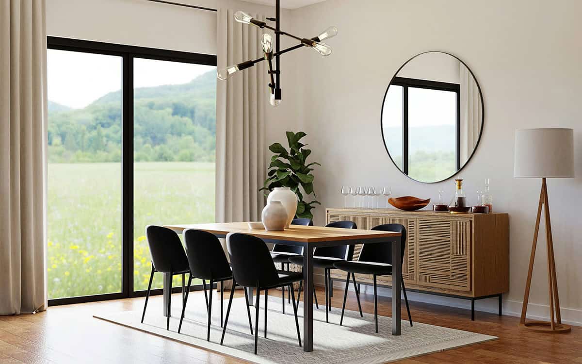
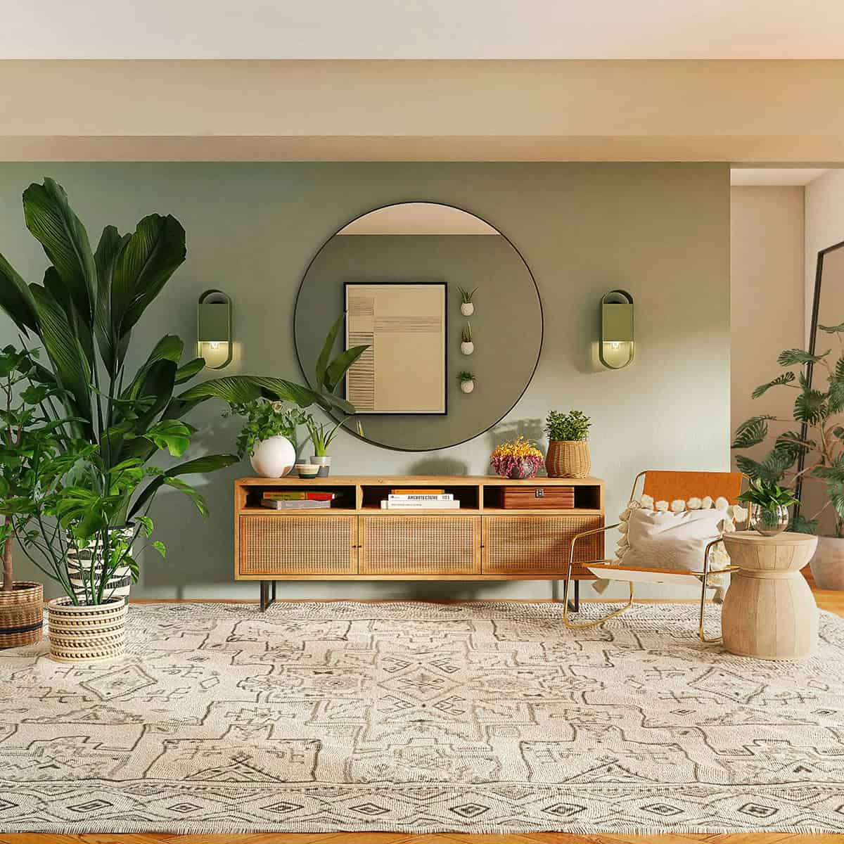
2. Shape and Form Opposition

Shape and form opposition brings variety by pairing curved lines with straight lines. Rounded furniture, like circular tables and arched doorways, contrasts with angular pieces. These include rectangular shelves and sharp-edged sofas.
This mix adds rhythm. It alternates between soft and hard forms, creating visual interest and tactile variety. It also affects how balanced a room feels. Curved and straight elements share visual weight in different ways.
3. Texture Opposition
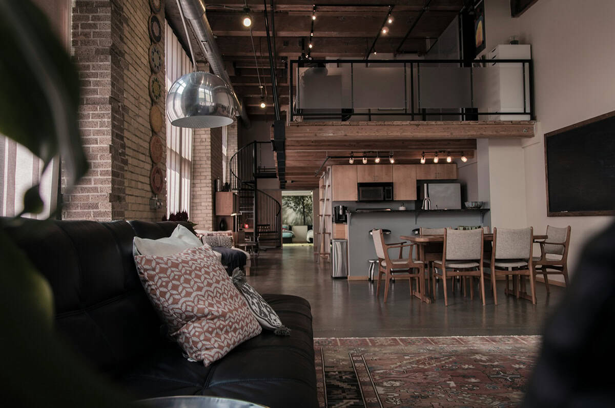
Texture opposition combines different tactile qualities to add depth and interest. Rough textures, like woven rugs and exposed brick, contrast with smooth surfaces
The variety in texture creates tactile interest and enriches the overall aesthetic. This contrast can make some design elements stand out. It does this by setting them against different textures.
4. Scale and Proportion Opposition
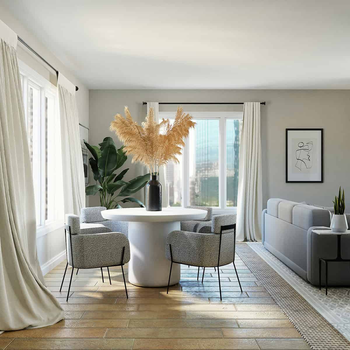
Playing with scale and proportion means using objects of different sizes. This helps direct attention and keeps everything balanced. For instance, a large, dramatic sofa can balance several smaller chairs or side tables.
Size contrasts add rhythm to a space. This makes it feel lively instead of dull. When you use scale opposition wisely, it creates a good balance. This way, no element overpowers another.
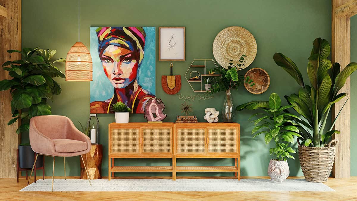
5. Style Opposition
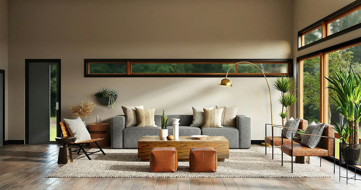
Style opposition blends different design styles to create dynamic, interesting interiors. Mixing sleek metal fixtures with classic wood furniture creates a striking design contrast.
This mix reflects personal style while adding complexity to a room’s visual story. Pairing a minimalist chair with a vintage rug surprises people. It creates a nice rhythm by mixing different styles.
Psychological Impact of Opposition in Interior Design
Opposition in interior design uses contrasting elements. This creates a strong focal point, which draws attention and evokes emotion. Used wisely, it can create excitement. Bright colors or shapes can energize a space.
Different combinations of contrast influence how occupants feel, impacting their behavior and comfort. For instance:
- Contrasting colors can stimulate energy.
- Opposing lines, such as curved against straight, add tactile interest and dynamic flow.
- Careful opposition contributes to a space that feels both engaging and harmonious.
See Also Harmony in Interior Design
Implementing Opposition in Different Spaces
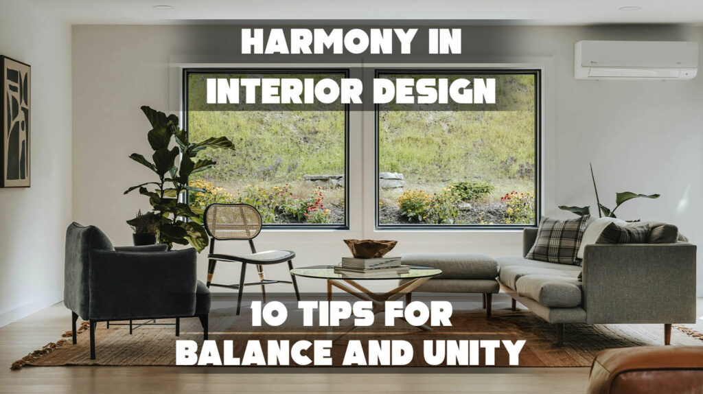
Living Room: Designers often use opposition rhythm in the living room. They mix contrasting colors or shapes to make a strong visual focal point. This strategy makes things visually appealing. It highlights important features, such as a fireplace or artwork.
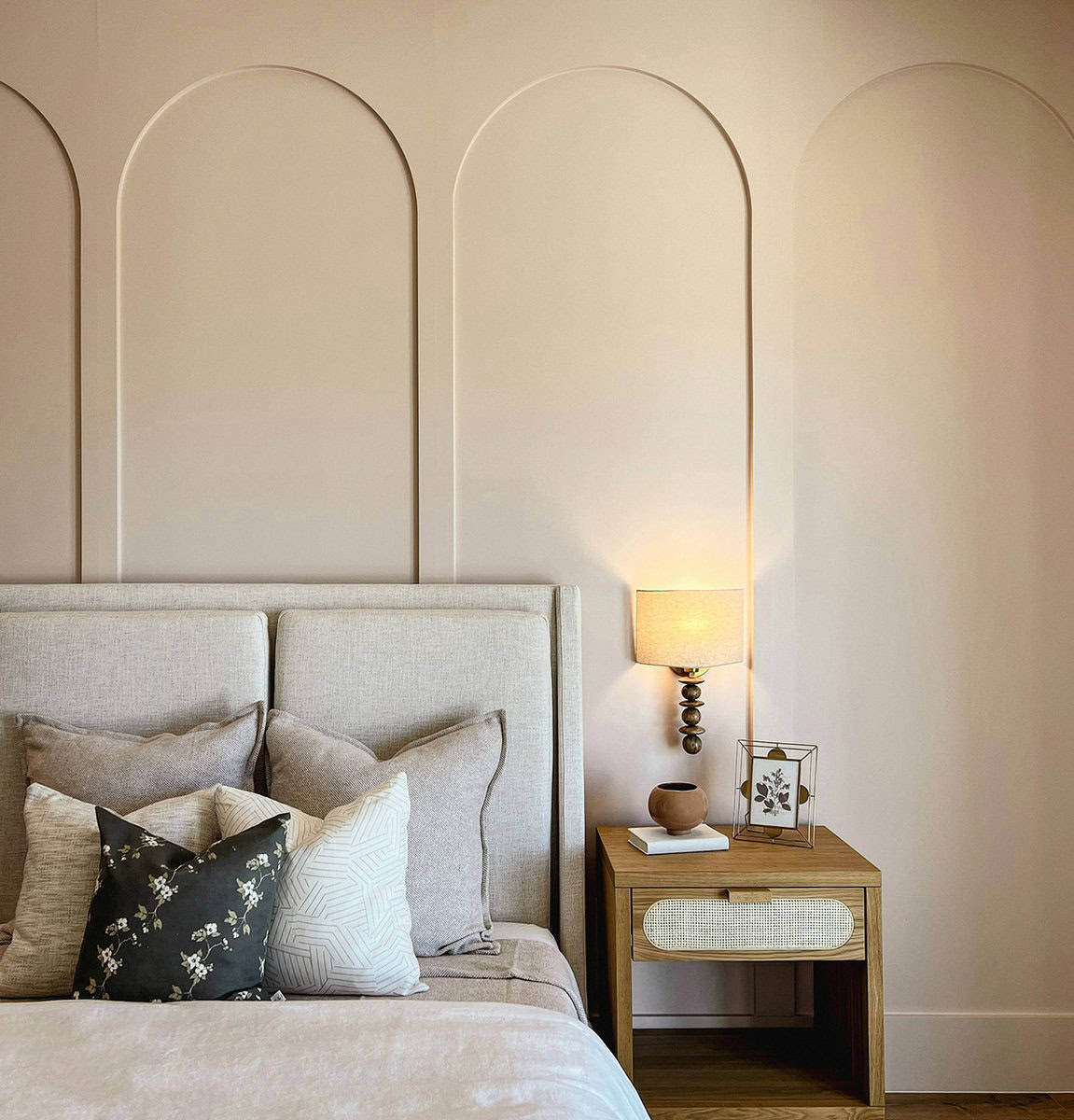
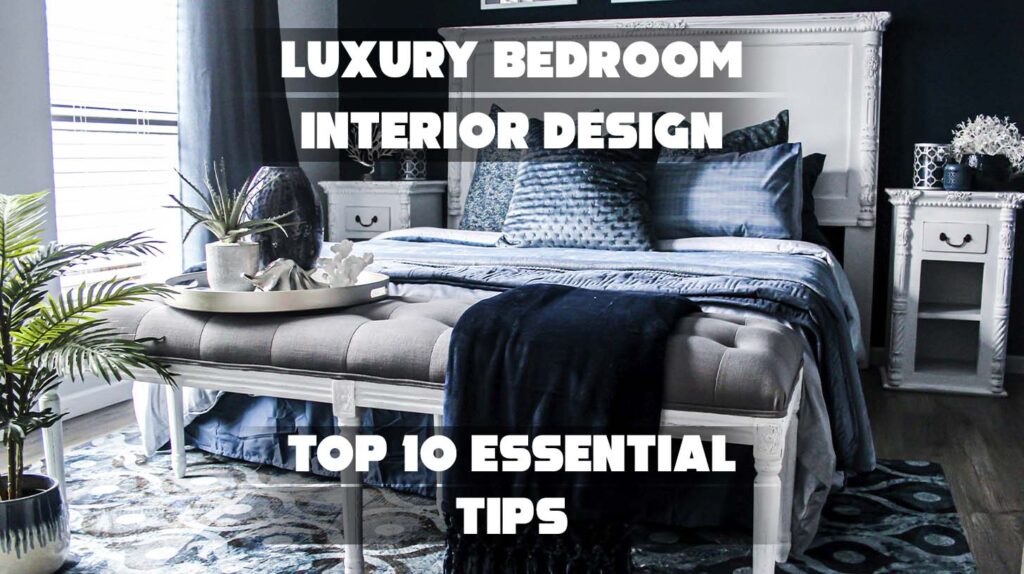
Bedroom: Bedrooms benefit from balancing tranquility with subtle contrast. Soft, muted tones mixed with some complementary colors create gentle contrast. This adds interest without disrupting the calm atmosphere.

Kitchen: Mixing curved lines with straight lines, or light colors with dark ones, enhances both function and beauty in kitchens. This balance improves flow while making the space more dynamic.
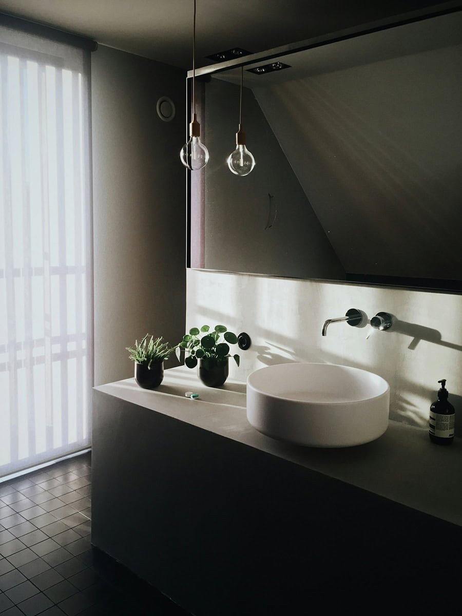
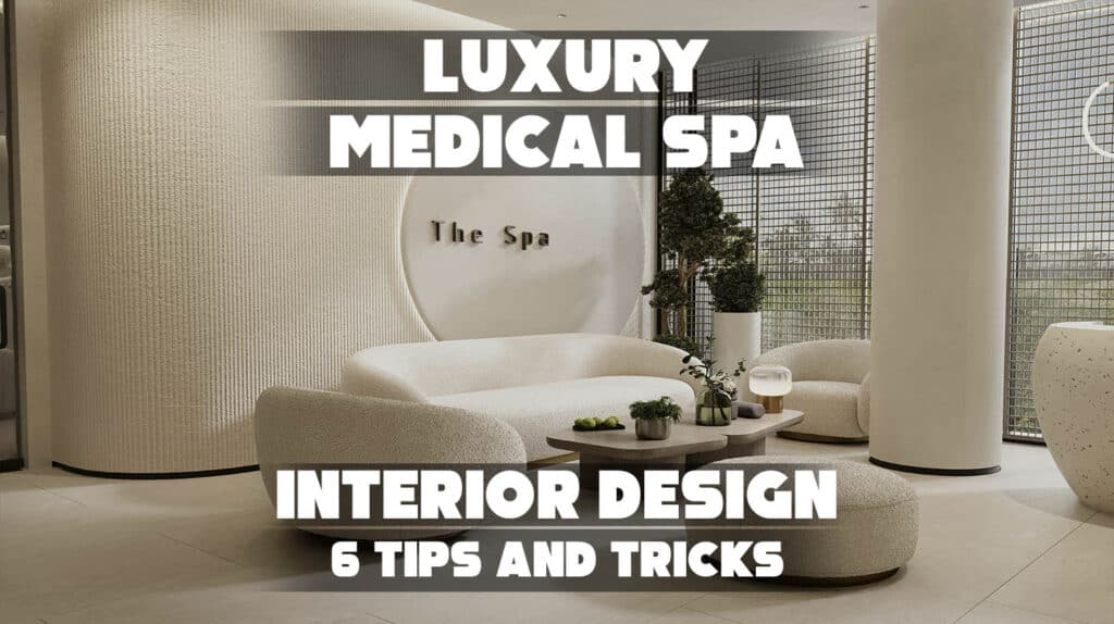
Bathroom: Bathrooms use opposition to elevate the feel of luxury. High-contrast finishes, such as matte and glossy surfaces, add elegance. Opposing colors in tiles and fixtures also enhance sophistication.
Top Opposition Design Mistakes
- One common mistake in using opposition in interior design is overusing contrast. Too many clashing colors, shapes, or textures can make a space feel chaotic. Instead of being dynamic, it may come off as messy.
- Poor coordination between different elements often disrupts visual balance. Mixing contrasting colors or lines can hurt the design. If they don’t align with the room’s focal point, it weakens rhythm and unity.
- Designers should balance one opposing element at a time. This keeps the space from feeling overwhelming. Combining curved and straight lines, or using complementary colors, makes visuals interesting. This approach keeps things from feeling cluttered.
Thoughtful use of opposition rhythm creates a space that is both dynamic and visually appealing. It balances well and avoids discord.
Opposition in Interior Design: A Recap
Opposition in interior design is a strong principle. It adds rhythm, balance, and visual interest to any dynamic space. Interior designers mix contrasting elements like color, shape, texture, and scale to create contrast that sparks emotion and enhances beauty.
Ready to transform your space using this impactful design principle? Use contrast to design spaces that look great and fit your style.